
Series Identity
Here are some brief breakdowns of the visual language of some series by The Swaddle.


1. TMI
TMI is a monthly series of crowdsourced awkward details and uncomfortable moments that come with occupying our bodies.
Challenges
-
How does one cut through the visual clutter around existing sex related content?
-
How does one portray sex in a way that doesn’t get instagram to flag it as explicit content?
-
What's a formula that can be replicated monthly in a way that still feels fresh?
Concept + Identity
Each image follows a quadruple symmetry pattern by repetition of a motif picked from the crowdsourced answers. It’s (almost) complementary colour scheme ensures it stands out when you scroll through social media.
2. 'Under Capitalism'
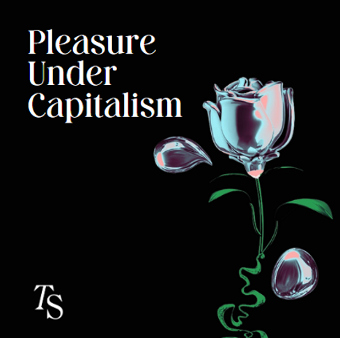
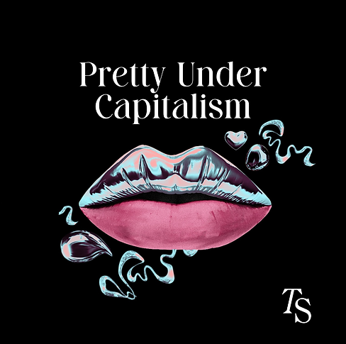
This series looks at how desire, intimacy, and relationships intersect with the logic of capitalism.
Concept + Identity
The almost surreal, dystopian look through the 3D metallic surface combined with naturalistic parts of the elements are reflective of how superficiality is beautifully packaged as different aspects of love.

3. The IIT Crisis


The following collateral is part of The Swaddle's long-form feature ' The Deserving and The Damned' . The images below were created to support Rohitha Naraharisetty's powerful reporting on the state of IIT today.


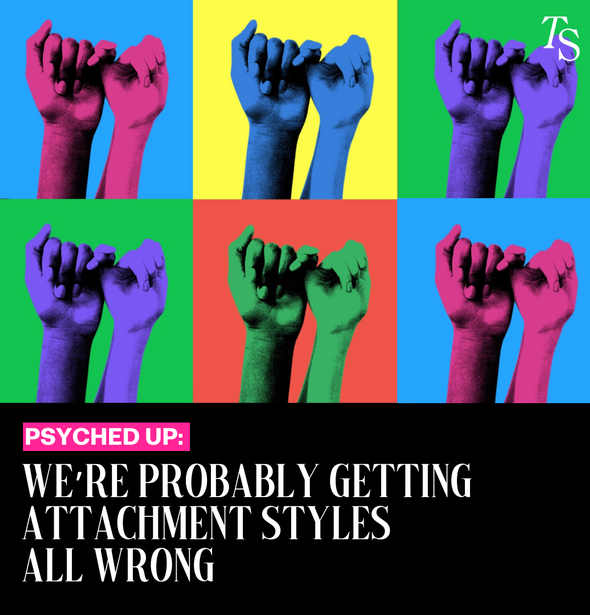
4. Psyched Up
Psyched up’s identity draws from
Andy Warhol’s pop art style -a critical response to mass production. It ties in conceptually with how psychology terms have been overused so much over the internet that it’s original intention has been devalued to a point where they’ve become meaningless buzzwords.
Concept + Identity
In 'Psyched Up', we find out what’s wrong with the pop psychology fads we love.


